
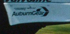
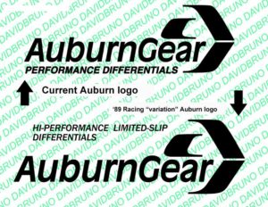
The AuburnGear corporate logo has not evolved much since the late ’80s. Their logo uses a box-stock typeface (Franklin Gothic) with a little chevron circle design element.
For 1989, there appears to be some variation to the “hi-performance limited-slip differentials,” in font weight and justification, so I assume the tag line was added as decals were cut.
[2018]