Creating “vintage-style” logos for Big Valley Ford

I’m a fan of pre-1970s racing cars. When a competition vehicle could be purchased from a new car dealer, driven on the street and race competitively while being a real motor vehicle.

During the 1950s and 1960s it was common to see dealer sponsors featured on competition vehicles of all sorts… either for a particular event, series of events, the entire season etc.

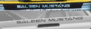
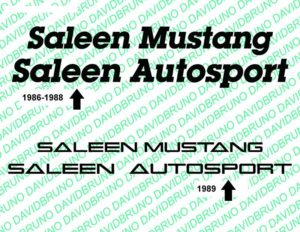
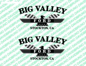
The 1988 Saleen Mustang remains that I have, appear to have begun as a dealer stock sales unit for Bill Valley Ford in California. So, with some brainstorming I decided to create a faux dealer logo for Big Valley… inferring they were a performance dealer… and bringing back to life the 1960s Ford Motor Company cross flags Thunderbird icon.

My "what-if" Big Valley Ford advertising logo.
My “what-if” Big Valley Ford advertising logo.

[2018]

Recreating the AutoExpress logo

Original Montgomery Ward decal on 1989 race car.

This is the logo that got my curiosity going. From 1987 through 1989 (and 1993) Montgomery Ward was a racing sponsor. Each season the logo arrangement for MW would change. Of these three different styles, I prefer the 1989 version.

Surprisingly the MW design is based on a regular typeface, but features a sprinkling of individual stylized letters to make their logo unique.

My version of the 1989 Montgomery Ward logo.

[2018]

Recreating the SCCA Pro Racing & SCCA Club Racing logos

Late 1980s SCCA decal, as seen on 1989 racing car.

It appears 1988 introduced new Sports Car Club of America (SCCA) logos. 1989 was the final year for the Showroom Stock GT class as a Pro Series. Starting in 1990 SSGT became a Club Series with a grassroots feel (less money). The SCCA used box-stock typefaces for their late-80s and early-90s era of logos.

My versions of SCCA logo.

[2018]

Recreating the vintage General Tire logo

1989 General Tire door decal.

The General Tire text logos were a nonissue. They were discovered be be a box-stock typeface. Just had to find the font. When reviewing General Tire advertisements from the 1980s, some ads used large spaces between letters while others were squeezed. Much like the 1986 vs. 1987-89 door decals on racing cars.

My versions of General Tire txt.

[2018]

Recreating vintage DynoMax logo

Original Walker/DynoMax logo.

For the Walker DynoMax logo I copied two corporate logos and combined them. No overdone effort on my park. The WALKER logo has changed since the 1980s to feature italicized font.

All the DynoMax print material I’ve seen to date use the merging letters and when Dyno is “open” without a fill; I have not seen it with complete outlines like used on 1988-89 racing cars. So, this may have been a race team modified logo.

My version.
My version.

[2018]

Recreating vintage ‘Saleen Mustang’ logos

Original 1989 racing car.

All of the 1986 through 1989 “Team Cars” had large SALEEN MUSTANG call-outs on both the front bumper cover and rear spoiler. I prefer the 1989 style, but completing both graphic projects were mainly a task in searching typeface listings and mimicking spacing. A few tweaks can still be made.

My versions.
My versions.

[2018]

Recreating vintage ‘Formula GP’ logo

Original Formula GT logo.

I thought this would be easier than it was. Thinking I could find a selection of typeface examples for text. It took like 3-4 different typefaces and modifications to individual letters to get close. Like how my “G” in GT was originally an “O.” Not 100%, but close enough.

My version of it.
My version of it.

[2018]