
The Escort radar detector banner was straight up Helvetica / Helvetica Neue. No big deal.

[2018]

The Escort radar detector banner was straight up Helvetica / Helvetica Neue. No big deal.

[2018]

All of the 1986 through 1989 “Team Cars” had large SALEEN MUSTANG call-outs on both the front bumper cover and rear spoiler. I prefer the 1989 style, but completing both graphic projects were mainly a task in searching typeface listings and mimicking spacing. A few tweaks can still be made.
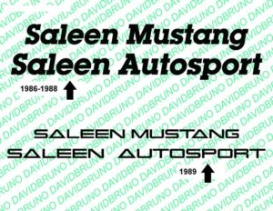
[2018]
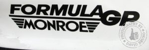
I thought this would be easier than it was. Thinking I could find a selection of typeface examples for text. It took like 3-4 different typefaces and modifications to individual letters to get close. Like how my “G” in GT was originally an “O.” Not 100%, but close enough.

[2018]
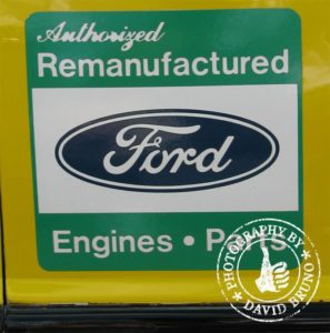

I have more confidence in recreating text/font layouts then I do with recreating illustrated logos. In the 1987 & 1988, Hunter equipment had a prominent decal with their corporate logo on each front fender. For 1989 Ford Authorized Remanufacted took over this spot. With few detailed examples of the “old” Hunter logo in my archive, I decided to recreate the FAM logos.
FAM callouts were stuck to each front fender and rear quarter panel with a full line of text on the front air damn. After searching through typefaces, I believe I have a fairly close representation.
As a curiosity side note: The 1989 racing cars used large color FAM decals, while the collection of display/promo racing cars with updated 1989 sponsors used smaller b&w FAM decals.
Also misc racing teams in 1989 with FAM support used slightly different decals and fonts… so each racing team may have been responsible for decal creation.

[2018]
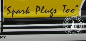
More Champion… first the battery then the plugs… The tag line “Spark Plugs Too” as seen on each door of the 1989 racing cars were a simple box-stock typeface. Just had to find it.

[2018]
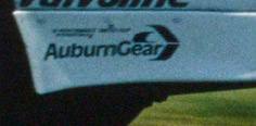
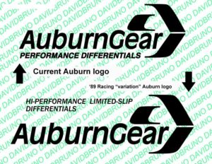
The AuburnGear corporate logo has not evolved much since the late ’80s. Their logo uses a box-stock typeface (Franklin Gothic) with a little chevron circle design element.
For 1989, there appears to be some variation to the “hi-performance limited-slip differentials,” in font weight and justification, so I assume the tag line was added as decals were cut.
[2018]
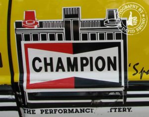
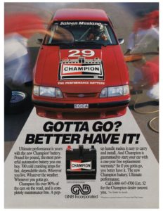
I thought the Champion Battery decal was fairly iconic on the 1988 & 1989 racing cars. It was a prominent 2-color printed decal. In my research a company called GNB produced the batteries and marketing. GNB does not exist today.
While looking at photos, I came to notice there were two drawn battery styles used on decals. What I call the “sloppy style” was seen on the sides of racing cars in 1988 & 1989. The “neat style” was used on the front air damns in 1989 and hood of the 1991 TransAm Scorcher car.
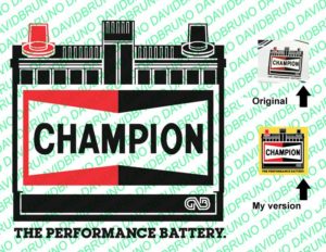
I split the difference and turned the sloppy style into a more precise illustration.
During the early 1990s, GNB changed their corporate logo… so I redrew the vintage GNB identification with the handy pen tool.
Did I try to locate original art? You bet, but came up empty. Next best option was to recreate the battery; after breaking the design into basic lines and rectangles. Which was my way of attacking the recreation.
The typeface used for “The Performance Battery” tag was a basic box stock font. Just had to go find it in the catalog. (Which was a common theme during these projects.)
[2018]

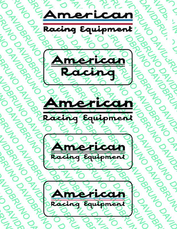
While reviewing and comparing brand logos though the years; at some point American Racing Equipment became… American Racing Custom Wheels… so I need a new set of vintage decals. After locating and purchasing vintage ARE decals, I then decided I would rather make them.
[2018]
[2018]
The Red & White version(s).
[2018]